LIV
REID HOMES
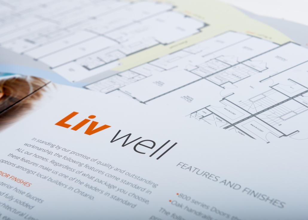
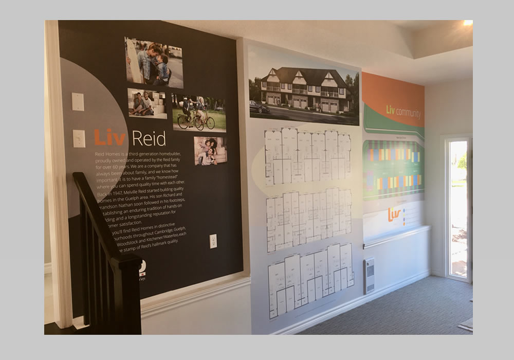
• Market Strategy • Brand Identity • Brochure Design • Display Design • Sales Centre Design
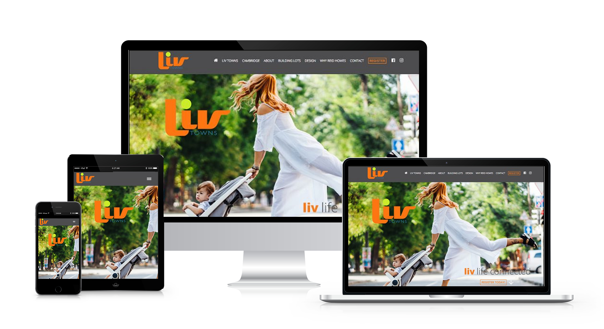
• Signage Design • Website Development • Digital Advertising • Drip Marketing • Social Media Planning
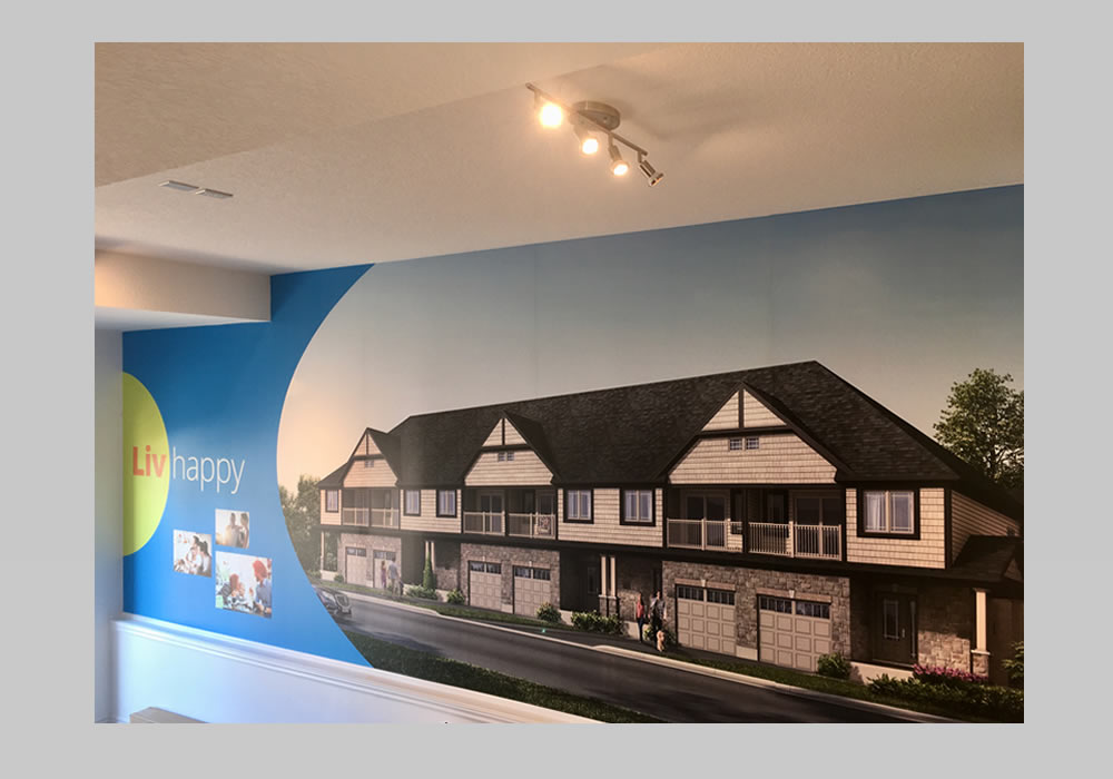
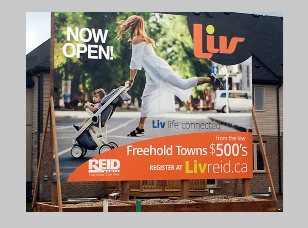
Situated just a short walk between Cambridge’s historic city centre and the new town with all its big-city comforts, Liv Towns was one of the last significant in-town development opportunities. Reid Homes envisioned an infill community of affordable townhomes that offered the best of urban living, with room to breathe.
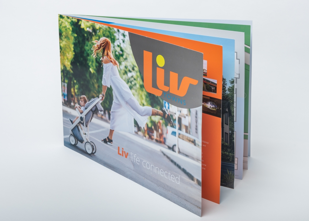
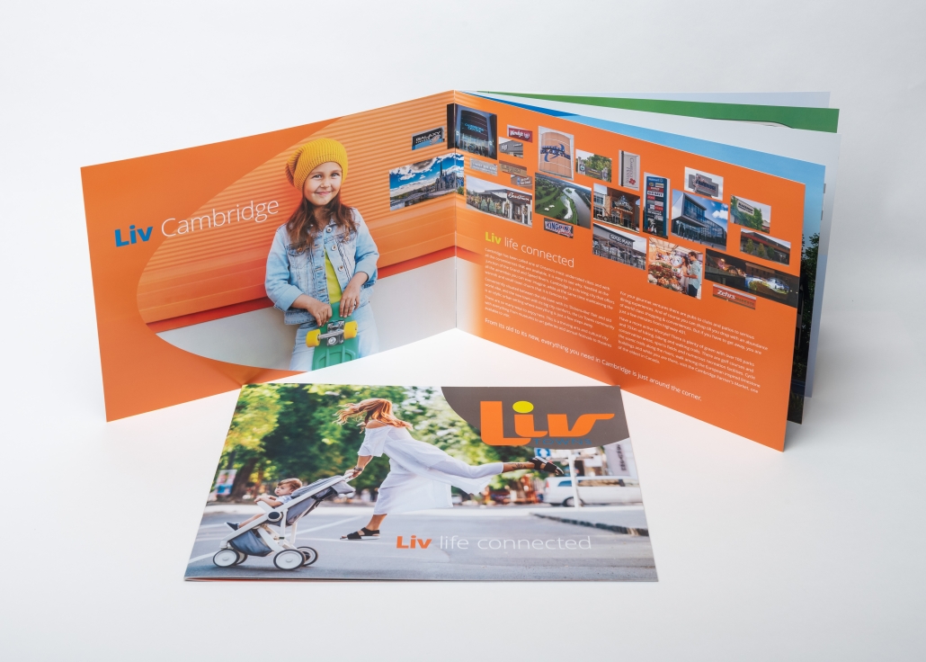
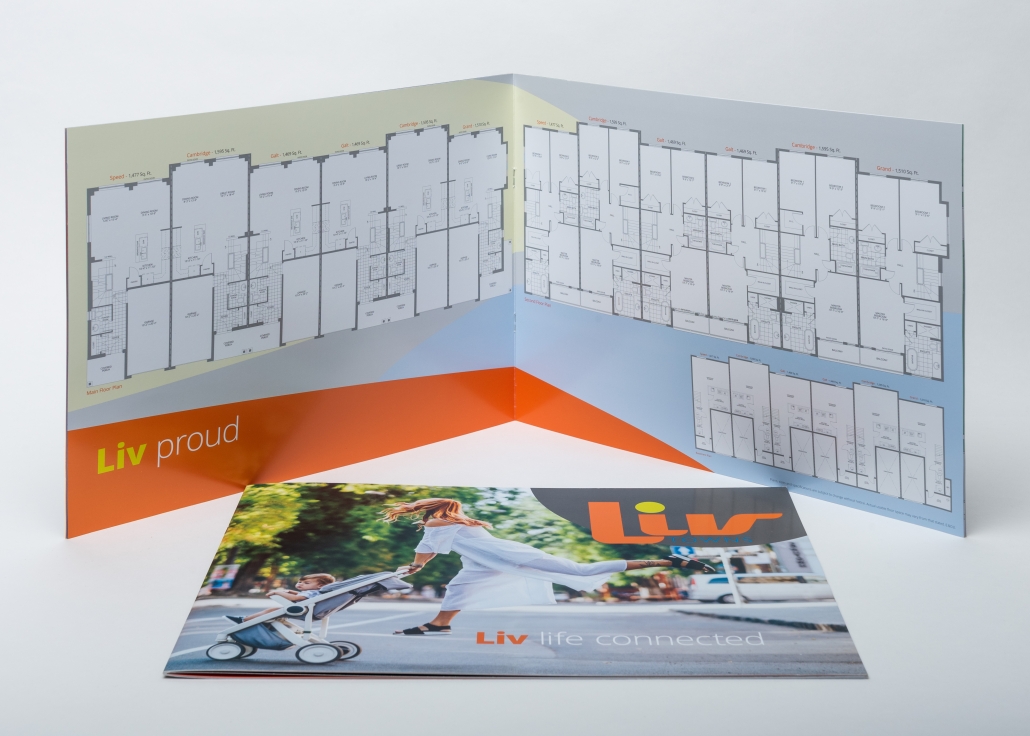
The branding needed to capture the energy of a young, active community. We developed a high-energy colour palette and a fun, fanciful visual theme designed to appeal to young families looking for a vibrant new place to call home.
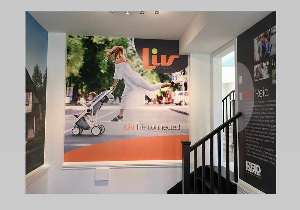
The clean, strong, contemporary logo features a vivid electric orange, accented with a sunny pop of citrus green and neon blue, all grounded by a deep asphalt grey. The result is intense, clean and exuberant, just like the lifestyle the community promised.
These weren’t just rows of townhomes. This was about creating a new life, a new community and a place where everything connects.
Welcome to Liv Towns, Live Life Connected.