Theo
CONDOMAN DEVELOPMENTS
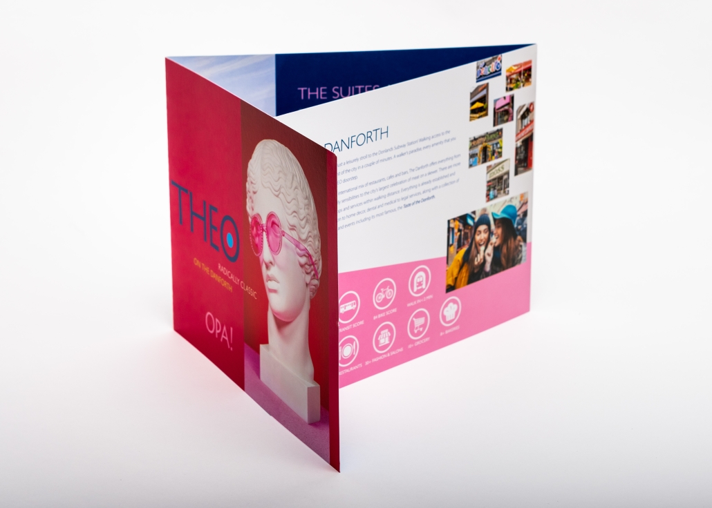
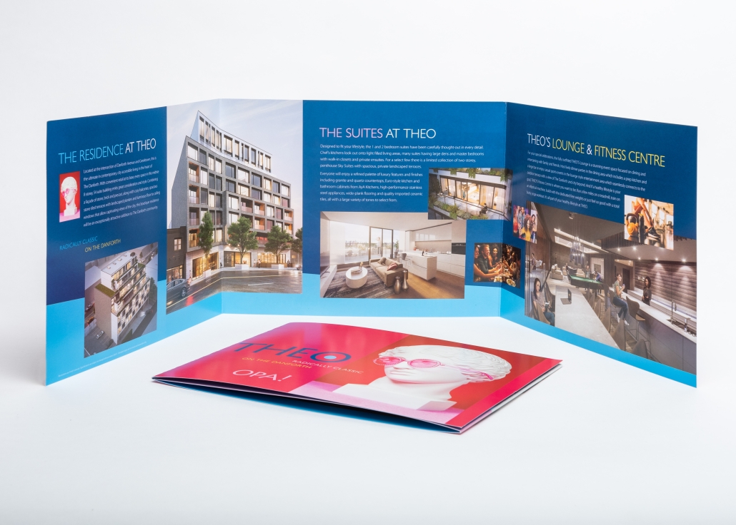
• Market Strategy • Brand Identity • Brochure Design • Signage Design • Website Development
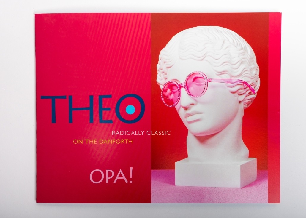
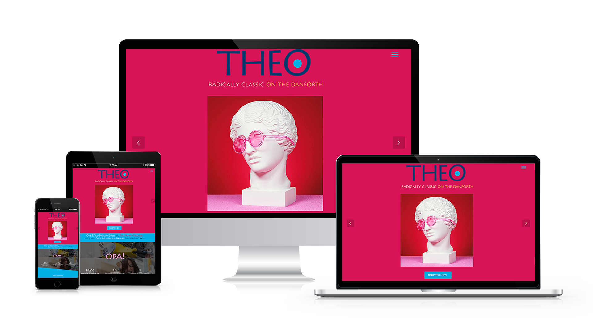
Condoman Developments’ latest project on The Danforth embraces a bold, irreverent interpretation of Greek culture, young, vibrant, ultra-modern and just a little bit cheeky.
Our creative approach was built around a radical juxtaposition of classic and contemporary: the timeless visual language of ancient Greece reimagined through a distinctly modern lens. Strong graphic contrasts, unexpected imagery and an energetic colour palette of bright azure blue, deep indigo and intense cerise red are punctuated with bursts of maize yellow for an unmistakable jolt of electricity.
The result is a visual identity that breaks decisively from the conventional look of new condominium marketing. It is confident, distinctive and highly ownable, designed to stand out in the competitive Danforth market while connecting with a younger generation of end users and investors.
The concept has successfully established Theo as something different: a project with personality, attitude and a point of view.
Welcome to Theo, Radically Classic on the Danforth.